Logo Design

  • Κατάσταση: Closed
  • Βραβείο: $15
  • Ληφθείσες Συμμετοχές: 11
  • Νικητής: Crea8dezi9e

Σύνοψη Διαγωνισμού

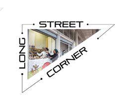
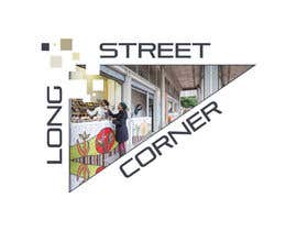
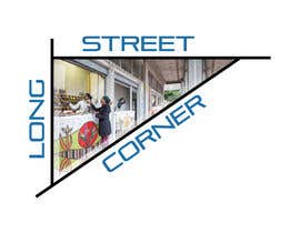
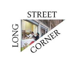
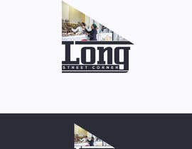
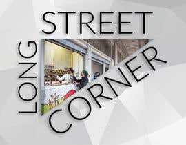
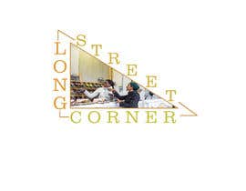
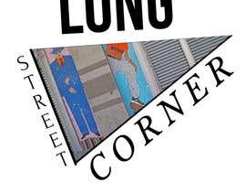
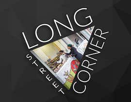
Design of logo for a project called Long Street Corner. This corner is home to 10 kiosks which sell food and consumer items ; these are all micro-businesses and some have their own individual logos. The Long Street Corner Logo is a group logo, which must have the personality of the space. Logo will be in shape of triangle. The words border the triangle. Inside the triangle I have a pic of the actual corner, which houses 10 kiosks. The pic has depth perception and the pic should show the unique mosaic on the first kiosk, and lend a sense of depth perception, from the first kiosk to the end. This logo will be used in the top left hand corner of every leaflet, publication and on-line ad which we publish.

Προτεινόμενες Δεξιότητες

Σχόλια Εργοδότη

“Interpreted the brief exactly as requested. It was very simple job and a simple response was required. Also provided artwork in colour and B & W, which is important for faxing, B&W copying etc. The low price reflected the need for simplicity and this was delivered. Changes could be made in future given the limitations of working online. ”

Εικόνα προφίλ NavineSC, South Africa.

Κορυφαίες καταχωρήσεις από αυτόν τον διαγωνισμό

Προβολή Περισσότερων Συμμετοχών

Δημόσιος Πίνακας Διευκρινίσεων

  • NavineSC
    Κάτοχος Διαγωνισμού
    • Πριν από 5 χρόνια

    Thank you all. I will obtain opinions of others and make final award. I know it was not a large amount and thank you for your efforts. This is also my first time with freelancer, so looking forward to using the facility again.

    • Πριν από 5 χρόνια
  • NavineSC
    Κάτοχος Διαγωνισμού
    • Πριν από 5 χρόνια

    This is close to the idea. However, the logo needs to fit into the top left hand corner of a page. It would in fact, consume that corner of the page ; it would in fact serve a letterhead, of sorts. Also, the font sizes are not the same. The brand name is Long Street Corner, so probably not best to favour some words over others. The logo itself needs to be triangular, not a square. Hope I am being clear enough.

    • Πριν από 5 χρόνια
  • NavineSC
    Κάτοχος Διαγωνισμού
    • Πριν από 5 χρόνια

    Pathetic...I can do this myself.

    • Πριν από 5 χρόνια

Πώς να ξεκινήσετε με τους διαγωνισμούς

  • Δημοσιεύστε τον διαγωνισμό σας

    Αναρτήστε τον διαγωνισμό σας Γρήγορα και εύκολα

  • Λάβε ένα σωρό συμμετοχές

    Λάβετε Πολλές Συμμετοχές Από όλο τον κόσμο

  • Βραβεύστε την καλύτερη καταχώρηση

    Βραβεύστε την καλύτερη καταχώρηση Κατεβάστε τα αρχεία - Εύκολα!

Αναρτήστε ένα Διαγωνισμό Τώρα ή Ελάτε Μαζί Μας Σήμερα!