Subway Logo Redesign

  • Κατάσταση: Closed
  • Βραβείο: $40
  • Ληφθείσες Συμμετοχές: 100
  • Νικητής: conxquer

Σύνοψη Διαγωνισμού

I'm a student who needs a logo redesigned as part a school business/marketing project.

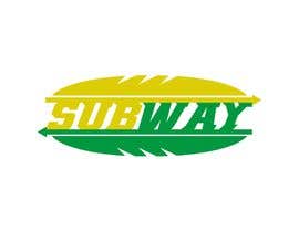
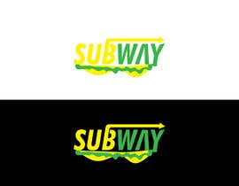
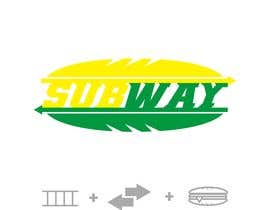
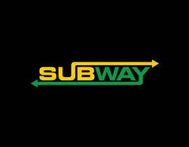
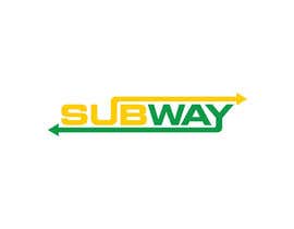
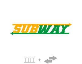
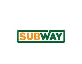
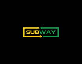
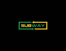
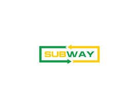
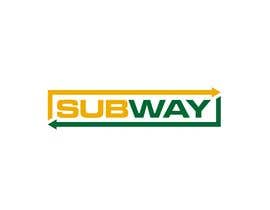
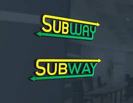
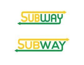
We are re-branding SUBWAY (yes, the sandwich fast-food chain).

Subway recently redesigned their logo (see attachment), however it looks too similar to the Waste Management logo, which is not a flattering connection for a "fresh" eatery.

The redesign should emphasize Subway as a sandwich shop that is speedy, efficient, ubiquitous, accessible, local, and modern. Colors to be used are green and yellow, with white as a possible accent; but take some liberty with the exact RGB values (especially to separate from the Waste Management palette). One concept might be to incorporate a modern, high-speed train, as long as it does not confuse the purpose of the company with an actual transportation provider -- feel free to try this or go any other direction. Hopefully you have some fun.

Will ultimately need vector and (medium-res) PNG file, please!

Προτεινόμενες Δεξιότητες

Σχόλια Εργοδότη

“Really understood the brief; worked quickly, provided suggestions. Total professional. ”

Εικόνα προφίλ SeveSanchez, United States.

Κορυφαίες καταχωρήσεις από αυτόν τον διαγωνισμό

Προβολή Περισσότερων Συμμετοχών

Δημόσιος Πίνακας Διευκρινίσεων

  • SeveSanchez
    Κάτοχος Διαγωνισμού
    • Πριν από 5 χρόνια

    Thanks to all that submitted. It was a difficult decision. There were some really terrific entries. (Special recognition to Tina C. who submitted some great efforts).

    • Πριν από 5 χρόνια
  • tony00006
    tony00006
    • Πριν από 5 χρόνια

    please check #162

    • Πριν από 5 χρόνια
  • moeezshah451
    moeezshah451
    • Πριν από 5 χρόνια

    PLEASE CHECK #143

    • Πριν από 5 χρόνια
  • moeezshah451
    moeezshah451
    • Πριν από 5 χρόνια

    please check #132 #133

    • Πριν από 5 χρόνια
    1. SeveSanchez
      Κάτοχος Διαγωνισμού
      • Πριν από 5 χρόνια

      Nice looking design, I just feel some of the other entries better capture the company's mission.

      • Πριν από 5 χρόνια
  • jahidhasannur
    jahidhasannur
    • Πριν από 5 χρόνια

    Please sir check my entry #128 #129 #130 #131 I hope you like that..........

    • Πριν από 5 χρόνια
    1. SeveSanchez
      Κάτοχος Διαγωνισμού
      • Πριν από 5 χρόνια

      I think they don't really capture the essence of the brand, but thanks for submitting!

      • Πριν από 5 χρόνια
  • newyour2018
    newyour2018
    • Πριν από 5 χρόνια

    Please sir check my entry #117 #118 #119 #120 #121 #122 i hope you like that...

    • Πριν από 5 χρόνια
    1. SeveSanchez
      Κάτοχος Διαγωνισμού
      • Πριν από 5 χρόνια

      Rated! The earlier ones are on the right track.

      • Πριν από 5 χρόνια
  • MHLiton
    MHLiton
    • Πριν από 5 χρόνια

    Please check #103 , #104 , #105 , Thank you.

    • Πριν από 5 χρόνια
    1. SeveSanchez
      Κάτοχος Διαγωνισμού
      • Πριν από 5 χρόνια

      Prefer the green/yellow to the silver version. It's a good attempt, I just think some of the other entries are closer to the desired direction.

      • Πριν από 5 χρόνια
  • sojib8184
    sojib8184
    • Πριν από 5 χρόνια

    #77

    • Πριν από 5 χρόνια
    1. SeveSanchez
      Κάτοχος Διαγωνισμού
      • Πριν από 5 χρόνια

      The blue is a little extreme. Also doesn't quite scream "speedy sandwiches."

      • Πριν από 5 χρόνια
  • saurabh8416
    saurabh8416
    • Πριν από 5 χρόνια

    please rate our design

    • Πριν από 5 χρόνια
  • newyour2018
    newyour2018
    • Πριν από 6 χρόνια

    Please sir check my entry #56 #57 #58 I hope you like that

    • Πριν από 6 χρόνια
    1. SeveSanchez
      Κάτοχος Διαγωνισμού
      • Πριν από 5 χρόνια

      I think they are a bit too similar to the current logo, unfortunately.

      • Πριν από 5 χρόνια
  • ovaisahmed4
    ovaisahmed4
    • Πριν από 6 χρόνια

    #54 #55 Please Check

    • Πριν από 6 χρόνια
    1. SeveSanchez
      Κάτοχος Διαγωνισμού
      • Πριν από 5 χρόνια

      Definitely among the better entries. I like what you've done at the front of the "S." The font maybe feels a bit wide.

      • Πριν από 5 χρόνια
  • mariaphotogift
    mariaphotogift
    • Πριν από 6 χρόνια

    40 USD for Subway logo? Hmmmmm… Interesting

    • Πριν από 6 χρόνια
    1. ovaisahmed4
      ovaisahmed4
      • Πριν από 6 χρόνια

      :D

      • Πριν από 6 χρόνια
    2. SeveSanchez
      Κάτοχος Διαγωνισμού
      • Πριν από 5 χρόνια

      Haha, student budget is pretty limited for this project, unfortunately! But hopefully you can have some fun with this.

      • Πριν από 5 χρόνια
  • hashibmithu95bd
    hashibmithu95bd
    • Πριν από 6 χρόνια

    Please check #16 #13 & #21.Thank you

    • Πριν από 6 χρόνια
    1. SeveSanchez
      Κάτοχος Διαγωνισμού
      • Πριν από 5 χρόνια

      Of those three, #13 is the closest. Blue/red are a little too far away from Green/Yellow color palette.

      • Πριν από 5 χρόνια
  • saurabh8416
    saurabh8416
    • Πριν από 6 χρόνια

    why do you send water management png ? do you want logo like that

    • Πριν από 6 χρόνια
    1. SeveSanchez
      Κάτοχος Διαγωνισμού
      • Πριν από 5 χρόνια

      As mentioned in Project Description, the current Subway logo looks too similar to the Waste Management logo. I want a logo that does NOT look like the WasteManagement.png, please.

      • Πριν από 5 χρόνια

Προβολή περισσότερων σχολίων

Πώς να ξεκινήσετε με τους διαγωνισμούς

  • Δημοσιεύστε τον διαγωνισμό σας

    Αναρτήστε τον διαγωνισμό σας Γρήγορα και εύκολα

  • Λάβε ένα σωρό συμμετοχές

    Λάβετε Πολλές Συμμετοχές Από όλο τον κόσμο

  • Βραβεύστε την καλύτερη καταχώρηση

    Βραβεύστε την καλύτερη καταχώρηση Κατεβάστε τα αρχεία - Εύκολα!

Αναρτήστε ένα Διαγωνισμό Τώρα ή Ελάτε Μαζί Μας Σήμερα!