Create a variation of an existing logo idea

  • Κατάσταση: Closed
  • Βραβείο: $30
  • Ληφθείσες Συμμετοχές: 100
  • Νικητής: art89

Σύνοψη Διαγωνισμού

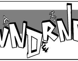
I have a logo idea (attached image) that I need a version. The basic is the words WNDRNG with A, E and I popping between them, the WNDRNG letters should be with a mild 3d effect, and AEI without. The logo should be black and white. The prettiest version will win the contest, a winner is guaranteed.

Προτεινόμενες Δεξιότητες

Δημόσιος Πίνακας Διευκρινίσεων

  • MagicalDesigner
    MagicalDesigner
    • Πριν από 10 χρόνια

    sir please check #109 thanks sir

    • Πριν από 10 χρόνια
  • MagicalDesigner
    MagicalDesigner
    • Πριν από 10 χρόνια

    sir please check #108 thanks sir

    • Πριν από 10 χρόνια
  • MagicalDesigner
    MagicalDesigner
    • Πριν από 10 χρόνια

    please rate #97
    thanks

    • Πριν από 10 χρόνια
  • MagicalDesigner
    MagicalDesigner
    • Πριν από 10 χρόνια

    please check #93
    thanks

    • Πριν από 10 χρόνια
  • MagicalDesigner
    MagicalDesigner
    • Πριν από 10 χρόνια

    sir please rate #91 ,thanks

    • Πριν από 10 χρόνια
  • denisaelena
    denisaelena
    • Πριν από 10 χρόνια

    and #85 , #86 , #87 , ...if you like the ideea, we can modify size, color of check mark, position...please rate

    • Πριν από 10 χρόνια
  • denisaelena
    denisaelena
    • Πριν από 10 χρόνια

    pls ck #83 ...u'll like it

    • Πριν από 10 χρόνια
  • GDesignGe
    GDesignGe
    • Πριν από 10 χρόνια

    you have brilliant taste and great look, ch

    • Πριν από 10 χρόνια
  • MagicalDesigner
    MagicalDesigner
    • Πριν από 10 χρόνια

    sir please check #68 thanks sir

    • Πριν από 10 χρόνια
  • Dehed00
    Κάτοχος Διαγωνισμού
    • Πριν από 10 χρόνια

    I think it will be better to try and stick more closely to the rough draft, and then adjust. For example, the WNDRNG shouldn't be so straight, they look like it was written in Word or something... Also, the IEA should be significantly smaller than the WNDRNG, and the "check marks" in between the letters are important but they shouldn't be so symmetrical too...

    • Πριν από 10 χρόνια
  • Dehed00
    Κάτοχος Διαγωνισμού
    • Πριν από 10 χρόνια

    Hi all, thanks for the entries so far, I'd really like the logo to keep it simple, and be a bit playful. Thanks!

    • Πριν από 10 χρόνια
  • sa37
    sa37
    • Πριν από 10 χρόνια

    plz check #2 .thku

    • Πριν από 10 χρόνια
  • utrejak
    utrejak
    • Πριν από 10 χρόνια

    Do you need the line drawing (bird like symbols) beneath the A E and I ?

    • Πριν από 10 χρόνια

Προβολή περισσότερων σχολίων

Πώς να ξεκινήσετε με τους διαγωνισμούς

  • Δημοσιεύστε τον διαγωνισμό σας

    Αναρτήστε τον διαγωνισμό σας Γρήγορα και εύκολα

  • Λάβε ένα σωρό συμμετοχές

    Λάβετε Πολλές Συμμετοχές Από όλο τον κόσμο

  • Βραβεύστε την καλύτερη καταχώρηση

    Βραβεύστε την καλύτερη καταχώρηση Κατεβάστε τα αρχεία - Εύκολα!

Αναρτήστε ένα Διαγωνισμό Τώρα ή Ελάτε Μαζί Μας Σήμερα!